
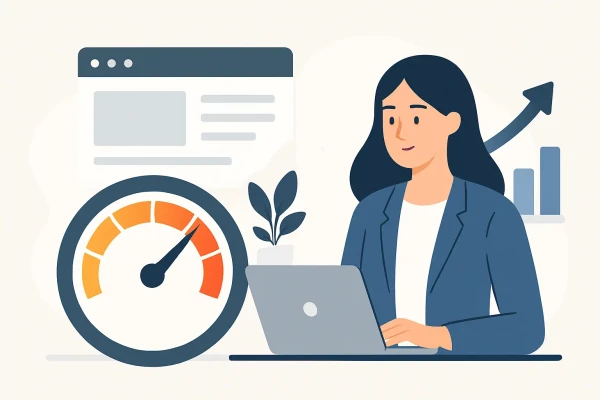
What Actually Lifts Website Conversions.
Practical conversion rate optimisation for websites - improve speed, clarity, forms, mobile UX and calls-to-action to lift leads and sales.
A website can be busy and still underperform.
That is the usual problem. Traffic arrives, pages get viewed, but enquiry forms stay quiet, bookings stay flat, and sales do not move enough to justify the spend. In most cases, the issue is not reach. It is friction.
Conversion rate optimisation for websites is the work of removing that friction. It means making more of your existing traffic complete the action that matters - submit an enquiry, make a booking, request a quote, call your team, or buy a product. For most small to mid-sized businesses, that is a better starting point than chasing more clicks.
What conversion rate optimisation for websites really means
This is not about clever button colours or random A/B tests copied from large overseas brands. It is about matching the page to user intent, then making the next step obvious and easy.
If someone lands on a service page from Google, they need quick confirmation that they are in the right place. They need to know what you do, whether you cover their area, why they should trust you, and how to contact you without effort. If any of those steps feel unclear, slow, or annoying, conversion drops.
Good conversion work usually sits across four areas: message clarity, page structure, technical performance, and trust. If one of those is weak, the rest have to work harder.
A fast website with vague copy will still leak leads. Strong sales copy on a slow mobile page will do the same. That is why conversion work needs a practical view of the whole site.
Start with the conversion goal, not the design
Many websites fail because every page tries to do too much. The header has six navigation paths, the hero section says very little, and the page asks the visitor to read before it asks them to act.
Start by deciding what each page is for. One page may exist to generate calls. Another may exist to get quote requests. A product page may exist to drive add-to-cart actions. Once that goal is clear, the page can be built around it.
This sounds obvious, but it is where many rebuilds go wrong. Design choices get made first. Conversion intent gets added later.
For service businesses, especially local operators, the strongest pages are often the simplest. Clear headline. Short supporting copy. Relevant trust signals. Strong call-to-action. Contact path that works properly on mobile. No dead ends.
Mobile is where most friction hides
A website might look clean on desktop and still be losing leads on phones.
That matters because mobile traffic often makes up the majority of visits. For many Bay of Plenty businesses, that is exactly how people find and check a provider - between jobs, in the car park, at home after work, or while comparing options quickly.
Common mobile problems that hurt conversion
Text can be too small. Buttons can sit too close together. Sticky headers can take up too much screen space. Forms can ask for too much information. Tap targets can be frustrating. Phone numbers may not be clickable. Maps, galleries, and popups may push the important content too far down the page.
These are not minor UX details. They directly affect whether somebody contacts you or leaves.
A practical test is simple. Open your own site on a phone and try to complete the main action using one thumb. If it feels slow, fiddly, or confusing, that is a conversion issue.
Speed affects trust before users read a word
People do not assess page speed as a technical metric. They feel it as hesitation.
If a page loads late, shifts around, or pauses before it becomes usable, confidence drops. That is especially true for first-time visitors. Slow sites look neglected. They feel less credible, even if the design is polished.
Speed improvements with direct conversion impact
Image size is a common problem. So is bloated third-party code, poor caching, and low-quality hosting setup. If your site is running on WordPress, OctoberCMS or other popular platforms, these issues are usually fixable without rebuilding the whole thing.
A lean build, proper caching, image compression, Cloudflare at the edge, and sensible plugin control can make a visible difference. The gain is not just a better score in a performance tool. It is lower abandonment and more completed actions.
This is also one area where trade-offs matter. Fancy animation, video headers, and heavy visual effects can look impressive in a design review. They often cost more than they return in actual conversion value.
Make the next step easy to spot
Visitors should not have to hunt for the contact option.
A strong call-to-action is not aggressive. It is clear. It tells the user what happens next and reduces the effort required to begin. "Request a quote", "Book an appointment", and "Call now" are all stronger than vague prompts like "Learn more" when the goal is lead generation.
The same applies to placement. Your main action should appear early, then repeat naturally as the page builds trust. If the user has to scroll to the bottom to find out how to contact you, some will not bother.
Good calls-to-action also match intent. A user comparing service options may be willing to request pricing. A user needing urgent help may want a direct phone link. A high-consideration service might convert better with a short consultation form than a hard sales prompt. It depends on the decision cycle.
Forms are often the biggest leak
Long forms reduce completion. Broken forms kill it entirely.
If your contact form asks for ten fields when four would do, expect drop-off. If it throws validation errors without clear help text, expect more. If it does not reassure the user that their message has gone through, trust suffers again.
For most service businesses, the best form is short and practical. Name, contact details, a short message, and perhaps one useful qualifier. Beyond that, only ask for information you genuinely need at this stage.
There is a balance here. Too little information can create admin work later. Too much can put people off. The right form length depends on lead value and buying complexity. A legal practice, a trades business, and a cosmetic clinic may not need the same approach.
Trust needs to appear before the ask
People do not convert because a button exists. They convert because the page feels safe enough to act on.
That means trust signals should appear close to decision points. Testimonials, review snippets, project examples, service-area references, qualifications, guarantees, response-time expectations, and clear business details all help. So does straightforward copy that avoids exaggerated claims.
Local relevance also matters. If you work across Tauranga, Mount Maunganui, Papamoa or Rotorua, that can support trust when it is used naturally on the right page. It confirms you are not a generic operator trying to sound local.
Trust can also be damaged by small things. Outdated design, broken links, missing SSL warnings, old copyright dates, and poor grammar all create doubt. Conversion optimisation is partly about fixing those quiet signals.
Use analytics, but do not wait for perfect data
Data helps, but many businesses overcomplicate this stage.
You do not need an enterprise setup before making useful improvements. Start with the basics. Which landing pages get traffic? Which pages lead to enquiries? Where do users leave? Which devices underperform? How many people start a form and fail to finish?
Heatmaps, session recordings, form tracking, and call tracking can all help if used properly. But even standard analytics, paired with a manual review, can identify obvious issues fast.
The trap is focusing only on what is easy to measure. Not every conversion issue appears neatly in a dashboard. Sometimes a page simply feels hard to use. Sometimes the message is too generic. Sometimes the phone number is visible but not prominent enough. Practical review still matters.
Conversion rate optimisation for websites is ongoing work
Most websites are not finished when they go live. They are version one.
Search behaviour changes. User expectations change. Your offer changes. Traffic sources shift. What worked when the site launched may stop working as well six months later.
That is why the best approach is iterative. Improve one meaningful thing at a time, measure the result, then keep moving. Tighten the headline. Reduce the form. simplify navigation. Improve mobile spacing. Speed up key templates. Test different CTA wording. Remove elements that distract from the main action.
Small gains stack up. A lift in mobile usability, a faster page load, and a clearer enquiry path can produce a noticeable increase in leads without increasing traffic at all.
If you are reviewing your own site, start with the pages that already attract visitors. That is usually where the quickest gains sit. You do not need a full redesign to improve outcomes. Sometimes you need clearer intent, less clutter, and fewer obstacles between interest and action.
If a website is meant to generate business, every page should help someone complete the next step with less effort. That is the standard worth building to.
Ngā Pōhi e Hāngai ana
 Pōhitia ki hea February, 2026
 Pōhitia ki hea May, 2026
 Pōhitia ki hea February, 2026

Whakapā mai me ka hiahia kia whakaterehia ā-matihikotia tāu pakihi!
Pae tukutuku, SEO & SEM, hoahoa atahiko, taupānga kawekawe, pūtaurima pae tukutuku – kōrero mai..