
Website Homepage Layout for More Enquiries.
A practical guide to website homepage layout for more enquiries, with clear sections, stronger calls to action, and better mobile conversion flow.
A good homepage does one job first - it helps the right visitor take the next step without thinking too hard. If you want a website homepage layout for more enquiries, the layout needs to guide attention, answer key questions quickly, and make contact feel easy on every screen size.
That sounds simple, but most homepages try to do too much at once. They stack sliders, vague headlines, competing buttons, and blocks of text that force people to hunt for the important part. A better approach is tighter and more deliberate. Give each section a job. Put the highest-value action in the clearest possible place. Then remove anything that slows the user down.
What a homepage needs to achieve
For most small to mid-sized businesses, the homepage is not there to explain everything. It is there to orient the visitor, build enough trust, and move them towards an enquiry, booking, or call. That means the layout should support decision-making, not just look polished.
A useful homepage normally answers five questions in quick succession. What do you do? Who is it for? Why choose you? What should I do next? Can I trust this business? If those answers are buried or spread too far apart, enquiry rates usually drop.
This is where layout matters more than decoration. Design style can support trust, but structure is what gets results. A clean homepage with a clear path will outperform a visually busy one nearly every time.
The website homepage layout for more enquiries starts above the fold
The top section does the heavy lifting. On desktop and mobile, this area should communicate the offer fast. A strong hero section usually includes a direct headline, a short supporting line, and one primary call to action. If your business relies on phone calls, you might include a secondary call button. If form leads matter more, keep the focus on one enquiry action.
The headline should be specific. "Quality service" is too soft. "Websites built to generate more leads on mobile and desktop" is clearer. Visitors should understand the outcome without scrolling.
Keep the supporting copy tight. One or two lines is enough to add context, such as your service type, area, or client fit. For local service businesses, this is a good place to mention the region if it improves relevance. A Tauranga accountant or Papamoa builder does not need to sound national if local trust is the real driver.
Visuals also matter, but they need to support the message. Use an image, interface preview, or brand graphic that reinforces the service. Avoid decorative banners that take up space without helping the visitor decide.
Put one main action in front of the visitor
A common mistake is giving every button equal weight. Request a quote, learn more, view services, read testimonials, download a guide, see our team - all at once. That creates drag.
Pick the action that best matches your sales process. If enquiries are your priority, the primary button should lead directly to that path. That might be a contact form, a short quote form, or a booking page. The wording should be plain and useful. "Request a quote", "Book a call", or "Get in touch" works better than clever copy.
Secondary actions are fine when they support decision-making, but they should not compete with the main one. A good example is pairing "Request a quote" with "View services". The hierarchy stays clear, and the hesitant visitor still has a path.
Structure the page in the order people think
After the hero section, the homepage should follow a practical sequence. Start with a concise overview of what you offer. Then show the core services or categories. Follow with proof, then remove friction around contact.
This matters because visitors do not all arrive ready to enquire. Some need 20 seconds of reassurance first. A homepage layout that reflects real buying behaviour feels easier to use.
A reliable order often looks like this in practice: core value proposition, services, credibility, process or benefits, then a clear contact section. That is not a hard rule, but it suits most service businesses.
Service blocks should be easy to scan
If you offer multiple services, show them in short, well-separated blocks. Give each one a plain heading, a one- or two-sentence explanation, and a clear next step if needed. Do not turn the homepage into a full services page. The goal is orientation, not detail.
Three to six service blocks is usually enough. More than that can work if the categories are tightly grouped, but once the section starts to feel crowded, visitors stop scanning and start skipping.
Trust signals should appear before the final contact push
Trust works best when it appears near the moment of decision. Testimonials, client logos, review snippets, years in business, project counts, or platform expertise can all help. The right choice depends on the business.
For a professional service, qualifications and local reputation may matter most. For a trades business, before-and-after images and review excerpts may do more work. For a web studio, showing practical strengths like mobile performance, CMS capability, and ongoing support can be more persuasive than broad claims about creativity.
Keep this section concise. One strong testimonial and a few proof points often work better than a wall of praise.
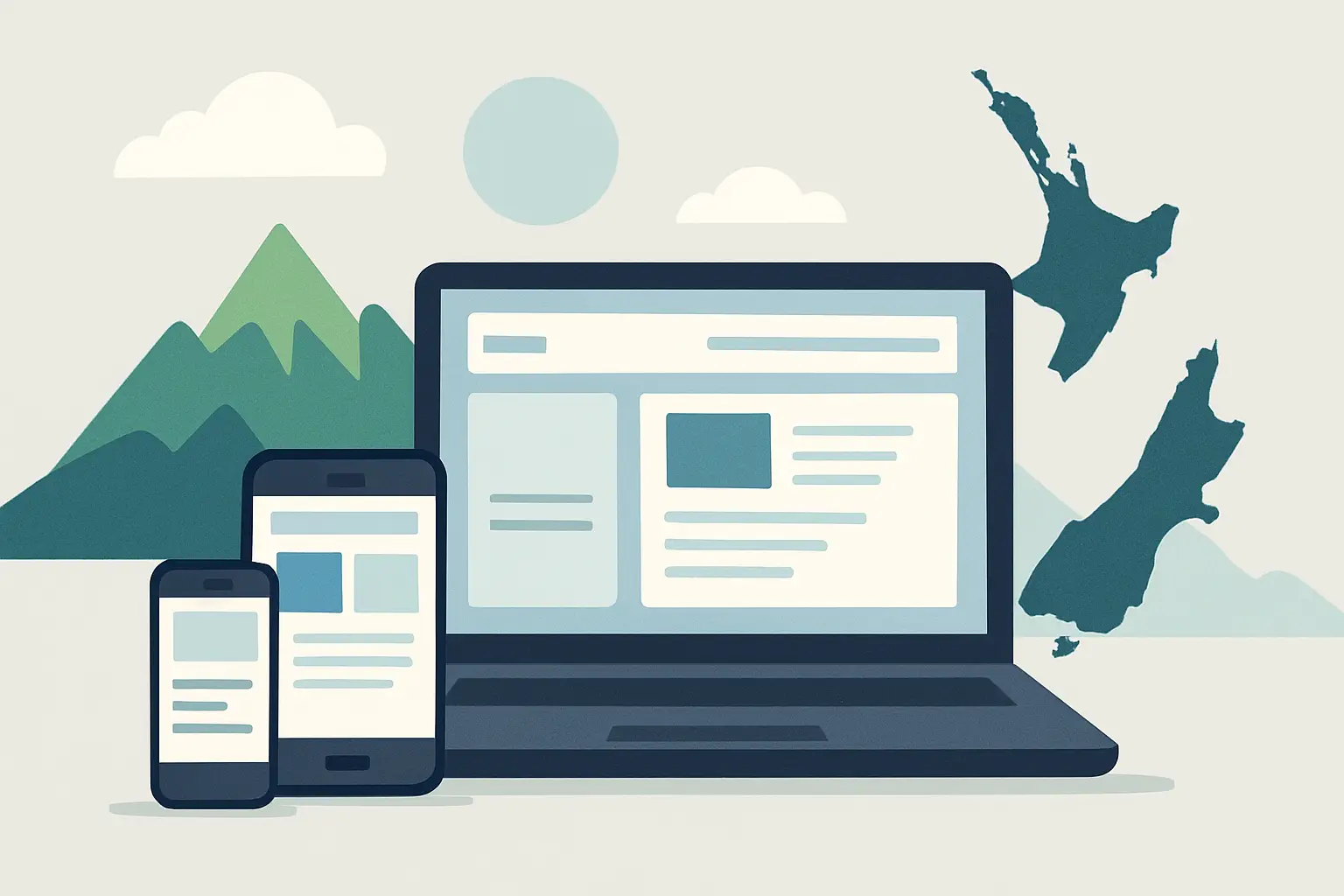
Mobile layout matters more than most businesses expect
A homepage can look excellent on a widescreen monitor and still lose enquiries on mobile. That happens when buttons are too small, forms are awkward, headings wrap badly, or contact info is hidden behind menus.
For a website homepage layout for more enquiries, mobile should not be treated as a compressed desktop version. It needs its own logic. The top call to action should be visible early. Tap targets should be generous. Contact options should be obvious. Important text should appear before large images where possible.
Sticky headers and sticky contact buttons can help, but only when used carefully. If they eat too much screen space, they become another obstacle. It depends on the audience and the action you want them to take.
Load speed is part of layout too. Heavy banners, oversized video, and layered effects slow pages down and break the flow before the visitor even starts. Fast pages feel easier to use, and ease supports conversion.
Keep forms short and contact paths obvious
If the homepage includes an enquiry form, keep it lean. Name, email, phone, and a short message field are often enough. Every extra field creates a small pause, and those pauses add up.
Some businesses get better results by putting a short form on the homepage itself. Others do better with a strong button that leads to a dedicated contact page. The better option depends on how much reassurance a visitor needs before submitting. Higher-consideration services often benefit from a separate contact page with a bit more context. Simpler services can convert well with an embedded form.
What matters most is that the contact path is always easy to find. Show the phone number in the header if calls matter. Include a contact section near the bottom. Repeat the main call to action after trust-building sections. Do not make people search.
What to remove from your homepage
Improving layout is often less about adding new sections and more about stripping out weak ones. Auto-rotating sliders are a common example. They split attention and rarely improve action rates. Long welcome messages usually do the same. So do generic stock photos that add bulk without adding trust.
Watch for duplicate messages as well. If the same point appears in the hero, the service summary, and the about section, the page starts to feel padded. Better to say it once, clearly, then move forward.
There is also a trade-off with homepage length. A very short homepage can work if the offer is simple and the audience already knows what they want. A longer homepage can work if visitors need more proof before enquiring. The key is not short versus long. It is whether each section earns its place.
A practical homepage layout that works
For many service businesses, a strong structure is straightforward. Start with a header that keeps navigation minimal and contact access visible. Follow with a hero section that states the offer and presents one main action. Then add a short services overview, a trust section, a brief explanation of how the process works or what outcomes clients can expect, and a final contact prompt.
That is enough for a lot of businesses. It gives the visitor a clear path without forcing them through unnecessary steps. It also makes the page easier to maintain over time, which matters if you want updates handled efficiently through WordPress or OctoberCMS without clutter building up.
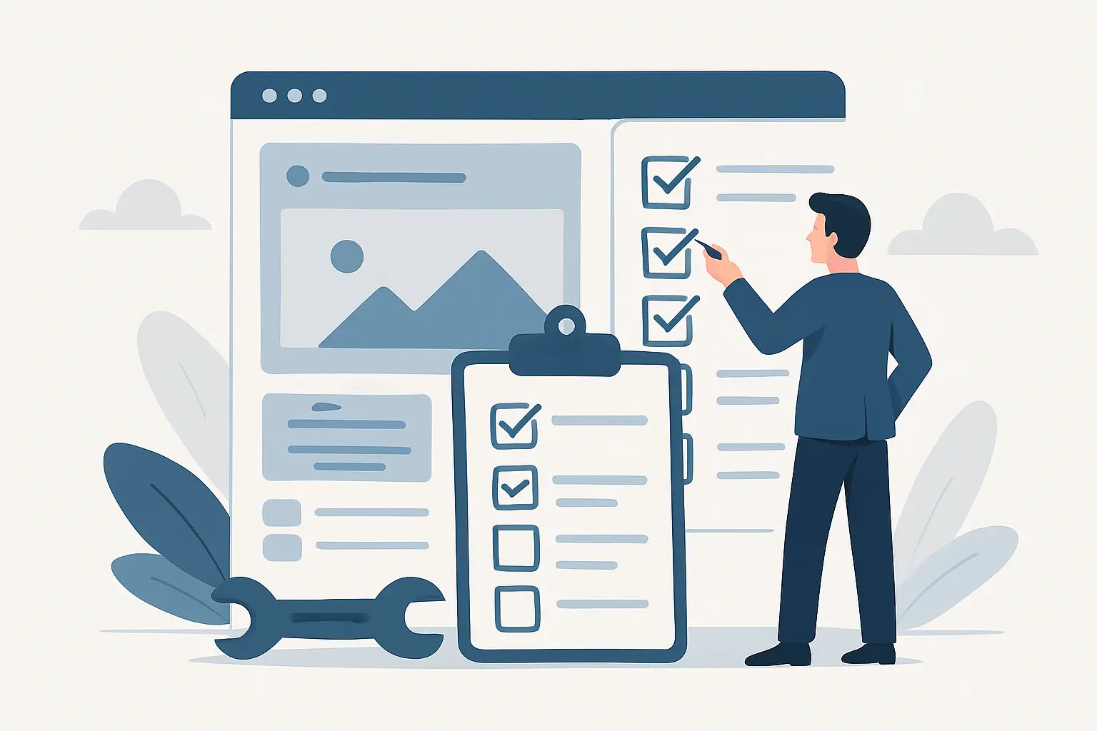
If you are reviewing your current homepage, read it like a first-time visitor. Can you tell what the business does in five seconds? Is the next action obvious? Is the mobile version just as easy to use? Those three checks will reveal a lot.
The best homepage layouts are usually the least dramatic. They are clear, fast, and easy to act on. When the structure respects the visitor's time, more people make contact - and that is the point.
Ngā Pōhi e Hāngai ana
 Pōhitia ki hea February, 2026
 Pōhitia ki hea February, 2026
 Pōhitia ki hea March, 2026

Whakapā mai me ka hiahia kia whakaterehia ā-matihikotia tāu pakihi!
Pae tukutuku, SEO & SEM, hoahoa atahiko, taupānga kawekawe, pūtaurima pae tukutuku – kōrero mai..