
9 Website Design Trends for Small Businesses.
Explore website design trends for small businesses that improve speed, mobile usability, trust and enquiries without adding complexity.
A good small business website now does more with less. The best website design trends for small businesses are not about decoration or chasing novelty. They are about helping people get where they need to go quickly, on any device, and take action without second-guessing the next click.
For businesses that rely on enquiries, bookings or walk-in traffic, that shift matters. A site can look current and still underperform if the mobile layout is clunky, the contact path is buried, or the pages feel slow. The stronger trend is practical design - clean structure, fast delivery, and clear intent on every screen.
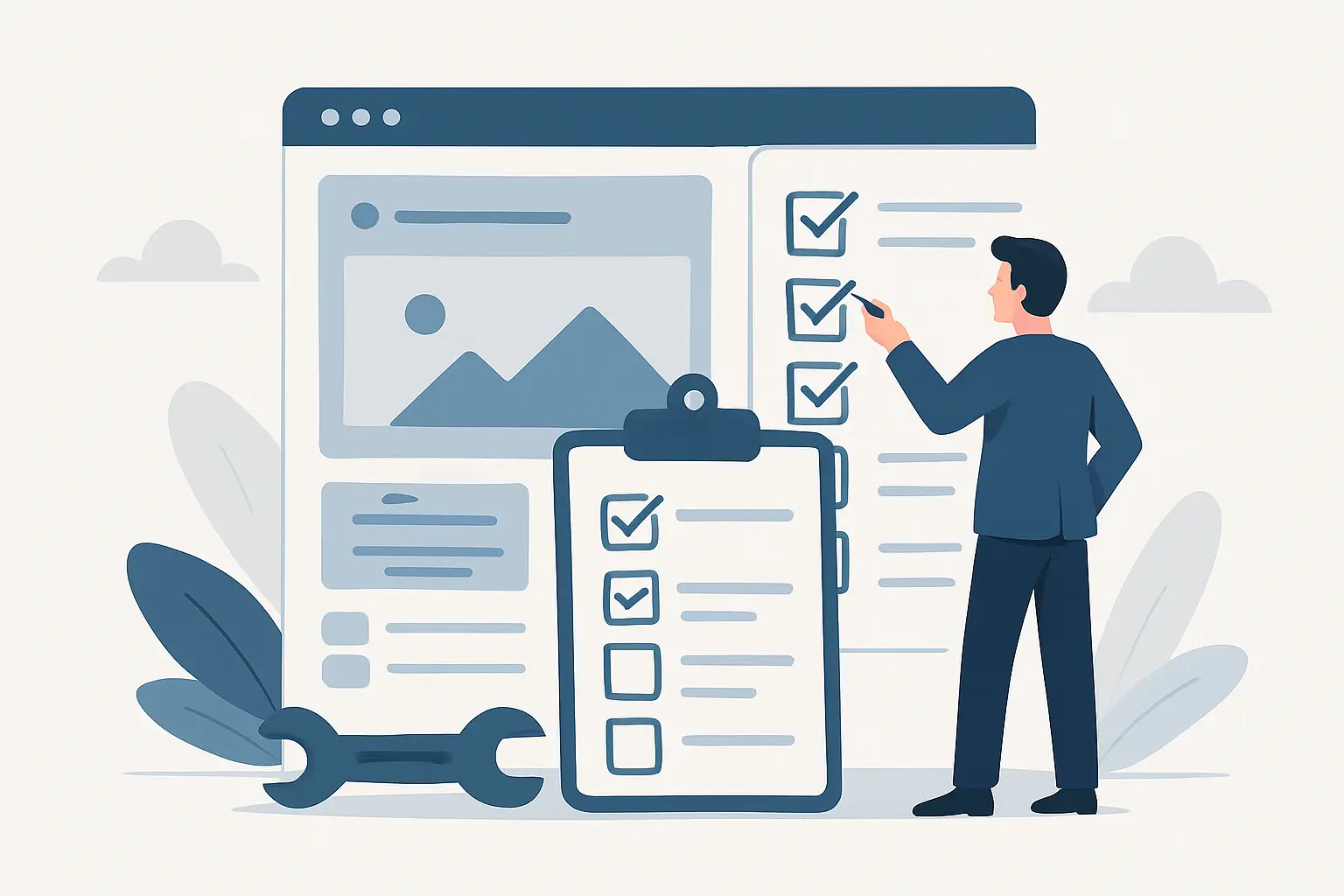
Website design trends for small businesses that are worth using
Not every trend deserves a place on a service website. Some suit design portfolios or big consumer brands more than a local trade, clinic or professional service. For most small businesses, the useful trends are the ones that reduce friction and improve trust.
1. Mobile-first layouts that prioritise action
This is no longer a nice extra. It is the baseline. More people will see your site on a mobile first, and small business websites need to be designed for thumbs, shorter attention spans and quicker decisions.
That usually means tighter page structure, larger tap targets, readable text, and buttons that appear early rather than after long scroll sections. Contact and quote actions should feel obvious. If someone in Tauranga is looking for a service while standing on a job site or between appointments, they do not want to hunt through a menu to find a phone number or booking form.
The trade-off is that mobile-first design often forces sharper decisions. You cannot keep every paragraph, every image and every menu item. That is a good thing. It usually leads to a better desktop experience as well.
2. Faster pages with lighter design systems
Visual polish still matters, but the trend has shifted away from heavy pages stacked with sliders, video backgrounds and oversized effects. Faster sites feel more modern than flashy ones.
A lighter design system uses fewer fonts, fewer competing styles and more consistent spacing. Images are still important, especially for local businesses that need to show real work, but they should be handled efficiently. The result is a site that loads quickly, feels stable, and does not make users wait for the basics.
This is where good design and good development meet. Performance is part of design now. If a page looks sharp but drags on mobile data, it is not doing the job.
3. Simpler navigation with fewer dead ends
A clear menu is one of the strongest signs of a modern business website. Users expect to understand the site structure straight away. They should know where to click for services, pricing context, about information and contact details without decoding clever labels.
The current trend is towards flatter navigation and shorter decision paths. Instead of building out a maze of pages, many small businesses are better served by fewer, stronger pages with clear sections and direct calls to action.
That does not mean every site should be tiny. If you offer multiple services or cover several locations, extra pages can help. The point is that each page should earn its place and move visitors towards an enquiry, booking or purchase.
Modern website design trends for small businesses focus on trust
A current-looking site is not only about style. It needs to feel credible within a few seconds. That is especially true for local service businesses competing with other providers who may offer similar pricing and similar promises.
4. Real imagery over generic stock visuals
One of the clearest trends is the move towards real business photography. Team photos, project shots, premises, vehicles and local work examples all help a small business feel established.
Stock imagery still has a place when it supports the design and fills a genuine gap, but overuse can make a site feel interchangeable. A law firm, builder, dentist and accounting practice should not all look like they were assembled from the same image pack.
For Bay of Plenty businesses, local imagery can quietly do useful work. Familiar streets, buildings or environments create context without needing to overstate location messaging on every page.
5. Cleaner typography and stronger content hierarchy
Modern websites are getting better at making content easier to scan. That means clear headings, short paragraphs, more breathing room and less clutter competing for attention.
Good typography is one of the most underrated design upgrades for small businesses. If people can quickly understand what you offer, who it is for and what to do next, the site feels more professional. It also helps on mobile, where dense blocks of text become hard work fast.
This trend works best when the writing is equally clear. Design cannot rescue vague copy. Service pages need plain language, useful detail and direct calls to action.
6. Social proof placed closer to decision points
Testimonials, reviews, accreditations and case-study snippets still matter, but the placement is changing. Instead of isolating all trust signals on one dedicated page, current sites place them near forms, quote buttons and service explanations.
That is a practical shift. Visitors often need reassurance at the moment they are deciding whether to contact you. A short testimonial under a service section or near a booking form can do more than a long testimonial page few people read.
There is a balance here. Too many badges, stars and floating widgets can make a site feel noisy. The better approach is selective proof in the places where hesitation is most likely.
The design trend behind better enquiries
Many small businesses are moving away from websites that simply present information and towards websites that support completion. That could mean an enquiry, a call, a form submission, a booking or a purchase.
7. Stronger calls to action without being pushy
The best calls to action are now more specific. Instead of repeating vague buttons like Learn More or Submit, websites are using clearer prompts such as Request a Quote, Book an Appointment, Check Availability or Call Now.
That change seems small, but it reduces hesitation. People know what will happen next. It also helps businesses align page intent with business goals. A service page should not end with a generic prompt if the real objective is to generate qualified leads.
Being direct does not mean being aggressive. For some businesses, a softer next step works better, especially if the service involves a longer decision cycle. It depends on the buyer journey, price point and level of commitment.
8. Shorter, smarter forms
Long forms are slowly disappearing from modern small business sites, unless the business genuinely needs detailed project information upfront. The trend is towards collecting only what is necessary for the next step.
A simple form often outperforms a complicated one because it asks less of the user. Name, contact details and a brief message may be enough to start the conversation. For bookings, the form can be shaped around availability and service type. For quotes, a few targeted fields may help pre-qualify leads without creating drop-off.
There is no single best format. A plumber, accountant and physio clinic will all need different enquiry flows. The useful trend is matching the form to the real business process rather than copying a generic template.
9. Ongoing design consistency across devices and updates
One trend that matters more than it gets credit for is consistency over time. A website should not only launch well. It should stay current as content changes, plugins update, devices shift and business priorities evolve.
That is where modern design systems and maintenance practices support the user experience. If new pages keep the same layout logic, forms continue working, buttons remain easy to tap, and performance stays steady, the website keeps doing its job without needing a full rebuild every year.
For businesses on platforms like WordPress or OctoberCMS, this matters. Design quality is partly what users see, and partly what happens in the background to keep the site reliable.
What small businesses should avoid chasing
Some trends look current for six months and date just as quickly. Extreme animation, unusual scrolling effects, over-styled menus and design choices that hide basic information can all hurt usability. If a feature gets in the way of reading, navigating or contacting, it is not helping.
Small businesses usually get better results by choosing modern standards over novelty. Clean layouts, fast pages, clear service explanations and dependable mobile use have a longer shelf life than visual gimmicks.
That is also the more cost-effective path. A website that is easy to maintain, easy to update and grounded in practical user behaviour will usually return more value than one built around trends that need constant redesign.
The best design choice is rarely the most dramatic one. It is the one that helps a real customer complete the next step with less effort. If your site can do that on mobile, tablet and desktop, it is already moving in the right direction.
Ngā Pōhi e Hāngai ana
 Pōhitia ki hea February, 2026
 Pōhitia ki hea February, 2026
 Pōhitia ki hea March, 2026

Whakapā mai me ka hiahia kia whakaterehia ā-matihikotia tāu pakihi!
Pae tukutuku, SEO & SEM, hoahoa atahiko, taupānga kawekawe, pūtaurima pae tukutuku – kōrero mai..